


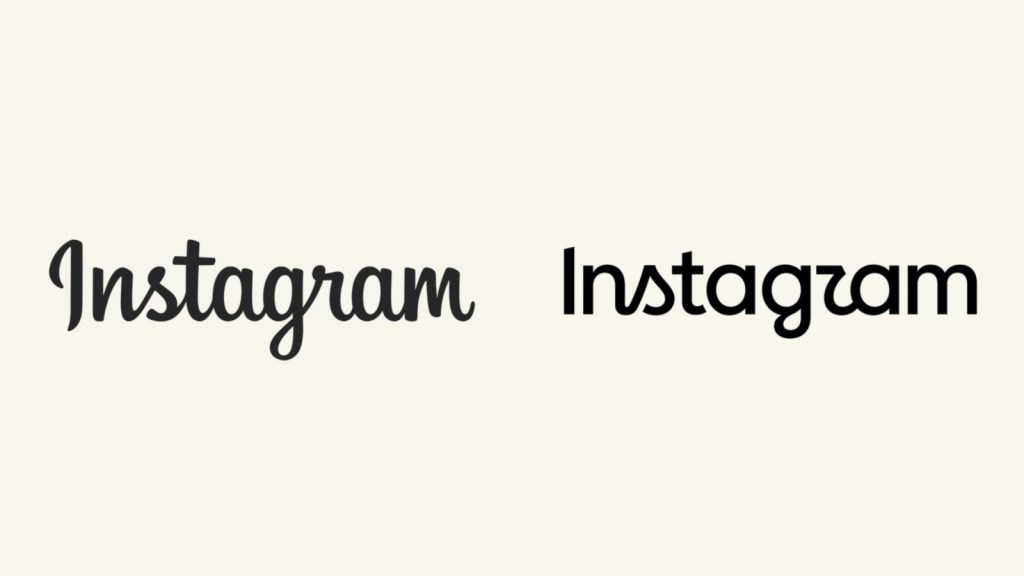
Instagram just touched something it hadn’t touched in ten years — and people noticed within minutes.
On Thursday, the Meta owned social media platform rolled out its first wordmark redesign since 2016. That soft cursive everyone got used to over the past decade? It’s done. Instagram swapped it for something tighter, more compact — a shift Adam Mosseri says had been a long time coming. Ten years without touching the logo, he figured, was enough. His words for the new version: “cleaner and more modern,” though he says it still carries pieces of the original.
Here’s the catch: the new “r” doesn’t quite look like an r anymore. Stretched and stylized, it bends just enough that at a glance, “Instagram” reads like “Instagzam.” Screenshots comparing the old and new wordmarks spread across X, Threads, and Reddit within hours. One commenter responding to Mosseri’s post captured the confusion directly, asking “is it just me or it reads: instagzam.” The Verge summed up the wider mood too, calling the update less legible and joking it “totally says Instagzam.” Others poked fun at the redesigned “s,” saying it now looks more like a tiny sailboat than a letter.
To be clear, this isn’t a full rebrand. The multicoloured camera icon everyone recognizes hasn’t moved an inch. What’s changing is purely the text logo, and it’s part of something bigger: two new typefaces, Instagram Pen and Instagram Mono, are joining an updated Instagram Sans, with the gradient itself being used more sparingly going forward. The full identity shift is expected to roll out gradually through the rest of 2026.
Reactions, unsurprisingly, split down the middle. The backlash got loud enough that comments on Mosseri’s original announcement post have since been limited.